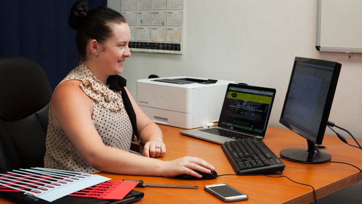
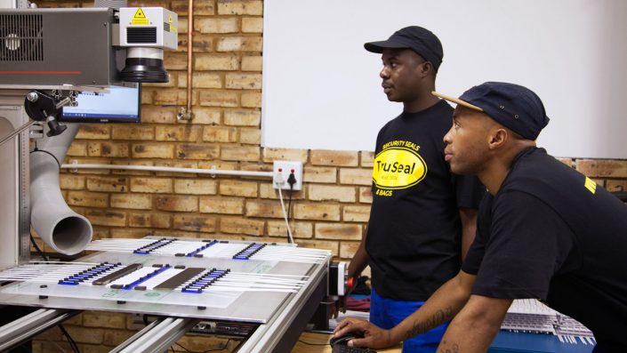
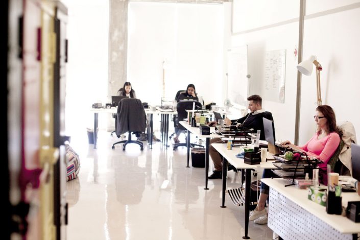
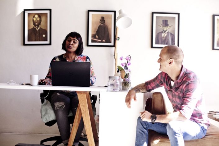
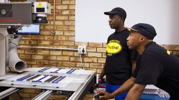
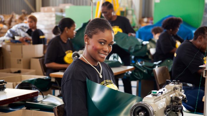
Avo Photography in Johannesburg created corporate portraits and storytelling images for TruSeal. TruSeal is a Johannesburg based Security Bags and Seals specialist. They needed storytelling images of their team and manufacturing facilities that would tell their story. Take a look at how their corporate portraits photography was used on their website to create trust and give potential clients a behind the scenes look into their operations:
Here are some of the corporate portraits and documentary storytelling images we created for TruSeal:
Photography is essential to modern marketing and plays an important role in social media, websites, brochures and production of annual reports. A combination of formal corporate portraits, documentary storytelling images and product photography was required to complete the story for TruSeal. TruSeal are the largest local manufacturers of Security Bags in South Africa. They ship and export their products to clients not just in South Africa but around the world.
Many companies these days find themselves in a position where they conduct business remotely with clients on the other side of the world or at least in another city. Corporate portraits are an important part of the digital collateral that help a new client relationship develop at a distance. Clients like to get a feel for the professionalism and reliability of the suppliers they deals with. The right images go a long way towards communicating who you are as a company.
Depending on the nature of your business and the type of products or services you sell different types of specialised photography may be required. Avo Photography is a team of photographers with diverse specialisations. In addition to corporates portraits and product photgraphy, we are able to help with: food photography, decor and interiors photography, industrial and architectural photgraphy, events photography and more. Get in touch with us to discuss the best way to tell your company story with corporate portraits photography.
make the right impression
Corporate portraits photography and headshots are a key element of your sales and marketing collateral. Annual Reports, brochures, catalogues, company websites, social media pages and other online profiles all require good quality images that make the right impression about your company and your team. Corporate portraits photography shows your audience who you are and what you are all about as a company in a way that is both professional and approachable. Experience shows that the right images are the most powerful way to create an impression and build trust in potential new clients.
Avo specialises in Corporate Portraits Photography in Johannesburg and Cape Town
Every business has a story to tell. And the way that story interprets into photographic images depends completely on the nature of the individual business and their product or service. Give Avo a call, one of our photographers will be happy to chat through your ideas and help turn them into solid executable concepts that suit your budget. We will suggest the most practical and cost effective solution for all of the shots you need. That may mean setting up a temporary portrait studio in the boardroom at your offices and then documenting your operations process; or setting up a shoot in studio with products or models; or even arranging appropriate sets and locations to tell your story while managing property and model releases if necessary.
corporate portraits photography, in studio or on-site
Shooting your corporate portraits on-site at your business using your offices or operations center as a backdrop is an effective way to give your audience a “behind the scenes” feel of your company. Alternatively if the look and feel you require calls for a white or plain coloured background we can set up a temporary corporates portraits photography studio in boardroom or office on your premises. We can also arrange to shoot your corporate portraits in our Johannesburg or Cape Town photo studio.
company story telling and corporate portraits photography
In addition to capturing individual or group portraits it is often desirable to tell a bit of a story about your company. Capturing corporate portraits of your team in their work environment is a great way to create an impression about what you do, the scale of your operation and how you work. An effective way to achieve this for your company is to shoot a combination of documentary story telling images, lifestyle portraits within the work environment and formal corporate portraits that can be used together.
how to get the best results from your corporate portraits photography
1. Make-up and grooming are important. Make sure your staff have been informed and come prepared on the day we are shooting. For best results we can arrange for a stylist to be present on the shoot day to do make-up, touch-up and fix hair so everyone is looking their best.
2. If you are doing individual corporate portraits and headshots it is a good idea to bring one or two changes of outfit so that you can get a few different looks going. This way you will get more options out of a single shoot and can have images to use for your online social media profiles (Facebook, Google+ and LinkedIn Profile Photos) and others that you can use for PR Photography and your company website team photos.
3. Consider the type of shots that you will require for your corporate portraits photography:
- Group Shots – if you’d like to show a shot of your entire company your photographer will need to come prepared with the appropriate lighting and equipment. It may be best to do a shot like this outdoors in front of your office building or factory. Having an elevated position (or long ladder) on-site for the shot is a good idea because it helps to get everyone in the large group into the shot.
- Team Shots – would you like to show some of your operations team together as a smaller group. For example: “The sales Team”, “The Directors”, “Factory Staff”, “Engineering Team”.
- Individual corporate portraits – LinkedIn Profile Portrait Photography and even the “About Us” page on your website may require individual portrait shots of each person in the company. Ideally these should all have a similar look and feel, so your lighting, backgrounds and poses should follow a similar theme.
- CEO and Directors portrait photography – the CEO and Directors are busy people and are usually pressed for time. We find it is best to setup a temporary staff portraits photography studio on-site at your offices and schedule slots where they can pop down for their shoot. Alternatively shooting them in their environment, their office or the boardroom is also a great option.
- Documentary story telling shots – what are the essential operation processes you want to capture? Are there specific pieces of equipment or environments (laboratories, assembly lines, server rooms, etc.) that you need to include?
4. Consider how and where your corporate portraits photography
Consider and discuss with your photographer how the final images will be used:
- Social Media and LinkedIn profiles photos will need to be appropriate for cropping square.
- Website pages (like the “about us” or “meet our team” page) may require long thin panoramic images, landscape/horizontal format rectangular (as opposed to portrait/vertical format rectangular images) or maybe square images.
- Brochures, catalogues and publications usually favour portrait/vertical format and sometimes want negative space left open to one side so that they can place copy/text.
4. What kind of impression do you want to make
Very often modern companies try to capture and attitude that is 60% professional and 40% friendly and approachable (or some variation of that). Some companies have a more fun or quirky brand identity, so they want to create something fun and different. Other companies are in a field or industry where seriousness and professionalism are held in the highest regard (legal firms, medical companies). Make sure to consider and discuss the type of impression you are trying to create.
Every business has a story to tell. And the way that story interprets into photographic images depends completely on the nature of the individual business and their product or service. Give Avo a call, one of our photographers will be happy to chat through your ideas and help turn them into solid executable concepts that suit your budget. We will suggest the most practical and cost effective solution for all of the shots you need.
Why do I need to pay for processing if the photographer shoots digital images?
Avo Photography uses professional digital cameras and generally shoots RAW images for all clients. Capturing images in RAW format allows us to produce the best quality final image result possible. Raw images are not directly usable for print, web or anything else, so they must be processed and converted into a usable format (Tiff or Jpeg for example). Read more
from concept to completion
Catalogue Photography is a rather specialised photography discipline, and depending on the type of product you are selling it may require models, a strongly themed concept or both to show your product off really well. Straightforward product shots for a catalogue can be executed more quickly (this is of course a cheaper way to go) but working with a strong concept designed around your products can be the difference you are looking for to make your catalogue photography something that really stands out and makes an impression in your customers mind.
concept catalogues vs. straight forward product shots
When capturing straight forward product photographs you want to shoot them beautifully and make sure the products jump off the page. This is however a simpler shoot, generally shot on a white background, you let the product speak for itself. Of course you do need to make sure that each product is lit correctly and laid out in a way that emphasizes its important features. Depending on what you want to say about your product you may want to dress it up a little with some styling. A concept catalogue photography shoot involves a thought out design that weaves together a story that can sell your product; also it keeps your potential clients attention for a lot longer.
What is the difference between a concept shoot and straight forward product shots for catalogue photography?
Examples of straightforward product shots, by Avo:
Examples of Avo product catalogue photography with styling:
Examples of Avo concept catalogue photography:
model: Lauren Thomas
Depending on your products it may make sense to use a combination of concept shots to hold attention and sell the product; and straightforward product shots to document and catalogue the various products. This kind of tailor made solution is a good way to gets a strong shoot that fits your budget.
Every business has a story to tell. And the way that story interprets into photographic images depends completely on the nature of the individual business and their product or service. Give Avo a call, one of our photographers will be happy to chat through your ideas and help turn them into solid executable concepts that suit your budget.
Rules of good catalogue design and catalogue photography:
1. Appeal to lifestyle desires, and the emotions that make a person buy. Sure sometimes people buy to fulfill a need, but more often than not they just buy because of want to. People choose one product over another because they envision feeling better, more satisfied after they have exchanged their hard-earned money for that product or service. Creating interest in your product and driving the desire to buy depends on how well you can appeal to your customer’s desire to attain a particular lifestyle. Show your customers how your product fits into the lifestyle they desire and you will sell more. Structure the different elements of your catalogue around conveying a particular lifestyle or aspiration. Your catalog might have an overall theme while the individual products shots could have their own mini themes. The copy (written text) you use should describe the product in sufficient detail to support a buying decision and answer the client’s questions; but it should also tell them how this product brings them closer to the lifestyle they want.
2. Tailor your catalog design to appeal to your specific audience. For example there would be a major difference between the design style of a business-to-business catalogue (B2B) and a business-to-consumer (B2C) catalogue. Catalogues aimed at younger people will have a different look to a catalog for older clientele. Your audience should feel some kind of affinity with your catalogue and the way it speaks to them.
3. The product should remain the focus of the catalogue. A rule of thumb in catalog design and catalogue photography conceptualisation is that the larger the product photo the greater the product’s sales. Devote more space to your more important (and most profitable products) the more total profit a product generates the larger the product photo should be. The product photography should also be supported by an appropriate amount of compelling copy. This is often more effective that displaying all products with equal importance. Sometimes in an attempt to save money on catalogue photography and printing products are grouped together in photographs. This can deliver less than optimal results as no product stands out to draw the customer in. It is better to show important items individually or in very small groups of related products. Showing products with no background allows the product to stand out from the clutter of the page. However, concept or lifestyle photography shot should be used to add variety to the design and convey lifestyle moods and speak to your customers aspirations.
4. Use great product photography in your catalogue. Creating a catalog is expensive and so there is a temptation to cut costs wherever possible. Skimping on the actual product photography is not the right place to cut costs. Product photography is the single most important element of the catalog design and if this is shoddily done it will hurt your success.
Using supplier images: In some industries and with some vendors you can get excellent photos of their products for use in your catalog. Just keep in mind that your competitors can use those exact same images. You will want to include images that show why you are different. For example one of our previous clients felt that their competitive edge came from their friendly sales team and consultants. They commissioned us to create some really fun lifestyle portraits of their entire team to show this aspect of their business. Very often supplier images are just not up to scratch. Almost all lack clipping paths requiring labor and expense before they can be incorporated into your catalogue design. This reduces the perceived savings of these free images, and your catalog will not have a unique look that truly communicates your unique market positioning.
Website product photography images: many companies start out with a web-based catalogue. This requires only low resolution images which can be supplied at a cheaper rate but will not be suitable for larger formats and for catalogue printing at a later stage. Be sure to think about whether you will be going to print with those images at some stage when ordering your catalogu photography, if you use low res images for print your product shots will be blurry.
Shooting your own catalogue photographs: If you have a decent camera and know how to use it, you may want to try taking your own product photographs. Bear in mind that the physical process of shooting the catalogue photograph constitutes about 1/3 the cost of preparing a digital image for use in catalogue design, but this is the most important contributor to the quality of the finished image. It makes sense to invest in professional photographer’s services that will be able to show each product in the best possible light. If the quantity of products you need to shoot makes the cost of professional photography prohibitive because of budget, Avo will be able to consult with you and help you to set up a general lighting setup on your site so that you get the best results possible. So if you must do your own photography at least get the setup right and be prepared to pay extra at the design side to prep those photos for printing. A great photo is “worth a thousand words” but a poor photo can damage a customer’s view of your company or product. Don’t risk it by skimping on good photography. It would be better to show fewer products on fewer pages to save on printing than to hurt your sales or company image with bad product shots.
5. Put important items on the outside edges of the page. People generally look at the top right of a page first then sweep across the page to the other side. If they don’t see something compelling they’ll skip over it. Therefore put your most appealing products on the outside top corners. Make these elements of the design stronger and larger in size the rest of the page.
6. Cross sell between products. Suggesting related products can increase your sales by 5 – 15%. You can cross sell product in your catalogue using the product copy, by using call-outs or by placing related products together on the page. Cross sell using your website: with advertising using multiple media simultaneously will result in greater response than the same forms of advertising run separately or at different times. The one feeds off the other. This is true for catalogues too. Take advantage of cross media merchandising by promoting your website in your catalog and your catalog on your website. You can upload your print catalog in pdf format for people to download, and mentin your website in the printed catalogue.
7. Use consistent type styles and limit their number. This is the kind of subtle design issue that any good designer will see to for you. It is also the kind of thing that makes a difference to the reader’s perception of your company without him realize why. It shows professionalism and builds credibility. Limit the number of fonts and font weights to 2 or 3, and keep a clean and consistent look throughout your catalog. Keep text spacing and placement next to images consistent. Be consistent with the style of text for common elements such as product name, product description, etc. Keep fonts to within your style and function don’t get too fancy unless your style requires it, very often “less is more”. Choose fonts that are easy to read and whose style matches the lifestyle desires you are trying to convey. Fancy fonts can reduce readability or even look unprofessional, they also create printing issues if the font is low quality or very small. Type should be secondary to product catalogue photos. The product itself is the focal point and that depends largely on the product catalogue photography. The text should support the reader to make a buying decision and not detract attention from the impact of the photographs.
8. Don’t change your look more than 20% from catalogue to catalogue. When you are starting to get tired of your look, because you have seen it over and over, your clients are just starting to recognize it as your brand image. Once a successful look has been established resist the urge to change. Protect the investment you have made so far into your brand, if you need to change rather do it in small increments over a long time. Repetition brings brand identity recognition and brand recognition brings acceptance and sales. That said, if your logo is really terrible it might be hurting your success. If your logo is holding you back you could benefit from a brand makeover, but such a decision should not be made lightly (or often). Invest in a professional design that will communicate what your company stands for, for years to come.
9. Design for economy and practicality. Postage rate and printing cost increase every year. Standard catalog formats are more economical and they also present less logistical issues. A catalog design that is too unusual in format may not fit the customer’s environment and may get disposed of fairly quickly (like an odd shaped business card that does not fit into a wallet). Conversely if your catalogue is too standard and plain it may come across as boring, and not get the attention you would like for your product.
10. Give products the space they deserve and analyze the results. Give your top sellers more space than your less important items. Products that generate the most total profit over time, not necessarily items with the highest profit margin, should get more space in your catalogue than lower profit items. The more space a product has in your catalog the greater the sales will be. The product that you punt hardest will experience increased sales, this will make a bigger difference to your bottom line if it is your more profitable product. About two months after your hits the streets you should analyse the profit results using surface area analysis. Calculate the total cost of the catalog (design, printing, mailing) divided by the total area of available selling space. Then work out how much each product cost to show in your catalog by multiplying the cost per area times the amount of space each item received in the catalogue. Compare this cost against the total profit earned on each item. The top 20% of most profitable products should get more space in your next catalogue. The bottom 20% should be given less space. By refining your catalogue design in this way over the years, you will optimize your return on investment.
To conclude, catalogue design requires that you speak to your clients needs and desires. Your catalogue needs to weave a story of how your product will enhance their life. Your catalogue photography will be critical in telling your products story. And you will need to present your information in a professional manner that inspires confidence in your company. You will also need to make slight adjustments over time to optimize your design.
ARTICLES
CONTACT DETAILS
CALL: 074 159 3132
EMAIL: STUDIO@AVOPHOTOGRAPHY.CO.ZA
Johannesburg Studio
Cape Town Studio
Plettenberg Bay Studio
(also servicing Crags, Knysna, Sedgefield, Wilderness and George in the Garden Route)
